

Real-time air quality data is crucial for helping individuals, particularly those in sensitive groups, to make informed decisions about day-to-day life. With interactive air quality maps, users can see current air quality at a glance in a simple, easy-to-understand format.
How Interactive Air Quality Maps Work
Air pollution interactive maps make it easier for everyday people to track pollutants and change their behavior based on real-time information.
An interactive map will show pollution concentrations and air quality index (AQI) scores with overlays of other conditions, such as temperature. Real-time or by-hour updates will help users get an approximate idea of what they can expect when heading outside.
With geolocation, users can pinpoint local conditions, view averages for their state, or find out what’s happening in other parts of the world.
Any interactive map should be user-friendly, with zoom, full-page options, filters, and the ability to view on a website or app. By integrating these features, developers can keep users engaged and updated with crucial air quality information.
Checking AQI in Your Location
The air quality index is highly localized for several reasons. Geographic features, such as mountains, lakes, and rivers, affect temperature, wind speed, and humidity. In urban areas, proximity to industrial centers influences the types of pollutants in the air and contributes to decreased air quality.
A good air quality map will allow users to check their current location, whether that is by using geolocation or inputting a ZIP code. An app could request access to the phone’s location data through permissions, while a website can include an address bar.
Users can then make informed decisions about their health based on the AQI in their area. For example, air pollution and physical activity are deeply intertwined. Because aerobic exercise increases a person’s respiratory rate, exercising outdoors when pollution levels are high can reduce the quality of a person’s workout and potentially lead to serious health problems later on.
Additionally, users can change their behavior when air pollution is high, such as closing windows, replacing air filters, or turning off their AC to prevent particulate matter from entering the home.
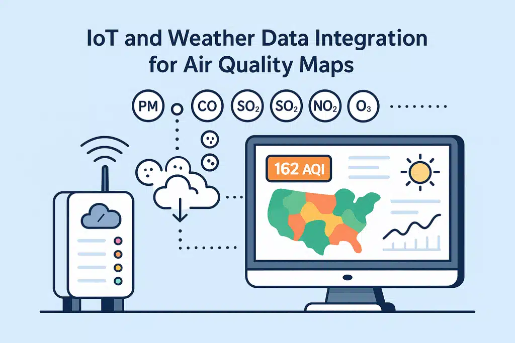
IoT and Weather Data Integration for Air Quality Maps
Data from air quality monitoring devices, such as Internet of Things (IoT) sensors, can be fed into maps for highly accurate and localized readings. Air quality sensors collect information on different types of pollutants, which is then transmitted to a cloud-based application or server for further processing.
Most air sensors will collect details on the five major types of air pollution as identified by the Environmental Protection Agency. These pollutants are as follows.
- Particulate Matter (PM): This mixture of tiny particles and gases can irritate the respiratory tract. It is formed from incomplete combustion, household cleaning products, and wildfires.
- Carbon Monoxide: Carbon monoxide is highly dangerous in confined spaces, but it can also contribute to respiratory diseases and neurological symptoms in lower concentrations.
- Sulfur Dioxide: A key component of acid rain, sulfur dioxide is produced by burning fossil fuels or industrial gases.
- Nitrogen Dioxide: Also caused by burning fossil fuels or industrial activities, nitrogen dioxide is linked to cardiovascular disease, asthma, and premature birth.
- Ground-level Ozone: While the ozone layer is a crucial component of what makes life on Earth possible, ground-level ozone exacerbates global warming and is a significant contributor to climate change. It is created when other pollutants, such as sulfur dioxide and nitrogen dioxide, interact with ultraviolet light.
Different pollutants are measured through tools such as electrochemical sensors, ultraviolet light, or ultrasonic detectors. Once various sensors collect the information, they are transmitted to a server, processed, and then requested by users through an API.
While air quality information is valuable on its own, it is significantly enhanced by incorporating weather data, such as temperature and precipitation, to provide a more comprehensive picture of current conditions.
A weather API, such as Visual Crossing, can be used to collect records on local conditions, combine them with air quality data, and build a high-quality, interactive map.
For those who would like to go even further, a weather query builder allows users to filter for specific information, such as data by time, location, and parameters like ozone concentrations. This will enable users to better understand how different factors are interrelated and make healthier choices about their daily activities.
Pollution Maps Near You and Their Benefits
Pollution maps are a valuable resource for communities, urban planners, and individuals concerned about their health.
Additionally, pollution maps can be powerful educational tools for the public. For example, a user-friendly map accompanied by a glossary of air pollution terms can educate individuals about ozone, particulate matter (PM), and carbon monoxide (CO). Users can click on different metrics to learn more about what particle pollution means, its sources, and how to protect themselves.
A color-coded air quality index will help individuals understand when the air may be unhealthy for sensitive groups. The standard AQI has categories based on the effects that different people may experience due to air pollution levels. These include the following categories:
- Green (0-50): The air quality is safe for everyone, and there are no major health risks.
- Yellow (51-100): This is generally considered healthy for most individuals, but some particularly sensitive individuals may experience health effects, especially due to ozone.
- Orange (101-150): The air is unhealthy for sensitive groups, but the average person will not experience health effects.
- Red (151-200): Everyone, no matter their health, may experience adverse effects from particle pollution.
- Purple (201-300): Serious health effects may impact everyone, regardless of underlying conditions.
- Maroon (301 and Higher): At this level, the air quality is extremely hazardous and considered a public health emergency.
Numerous groups can benefit from real-time AQI information. The general public can use it to plan their activities. At the same time, urban planners can review AQI data over time to inform new zoning restrictions or alert the public to hazardous pollution levels. Communities can also use this information to advocate for stricter environmental regulations, protect vulnerable members of the community, or plan activities together.
Final Thoughts on Interactive Maps and Public Awareness
Interactive air quality maps empower everyday people to take charge of their health by giving them immediate access to current air quality data. These maps support health decisions, improve environmental awareness, and inform urban planning for a safer, more eco-friendly community.
Visual Crossing provides the data that developers need to create accessible and educational maps, all of which are available through a simple API key. Whether you are focused on public safety or climate research, we offer air quality information and weather data that can help you build specialized applications, including air quality maps.