

Overview
The Multi-Site Weather Risk Monitor lets you track weather risks across thousands of locations simultaneously. Define the weather conditions that matter to your operations — high winds, freezing temperatures, heavy rain, and more — then monitor and filter your entire network of sites on a single dashboard with daily and hourly detail.
Whether you manage construction sites, oversee agricultural operations, or coordinate daily shipping logistics, the Risk Monitor gives you a fast, visual answer to the question: “Which of my sites are at risk today?”. The Risk Monitor was designed to handle permanent locations, changing locations or dynamic lists typically found in shipping manifests.
1. Getting Started
When you first open the Multi-Site Weather Risk Monitor you’ll see a welcome tutorial that walks through the three-step workflow:
- Add locations — adding the sites you want to monitor.
- Define risk criteria — creating the weather thresholds that matter to you.
- Run the analysis — load data and view results.
The screen is split into two panels:
| Panel | Description |
| Editor (left) | Where the creator/admin will configure locations, criteria, set date ranges, and business hours. |
| Results (right) | Where your analysis results appear in a calendar grid, map, or list views of colored threshold values. |
You can collapse the editor panel with the Hide Editor / Show Editor toggle to give the results dashboard more room. Note: Shared users will only see the results view and typically cannot edit the dashboard setup editors.
Users can create many different dashboards, but on first visit you will have a ‘New Tracker’ loaded for you to begin your creation process.
Next step is to define this tracker with locations, weather criteria and more…
2. Adding Locations
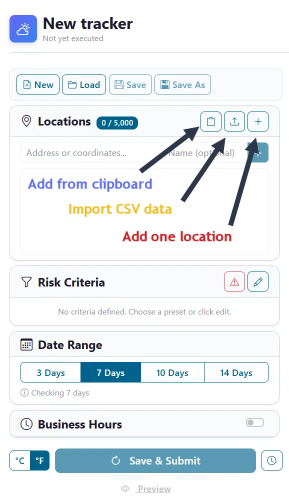
All weather queries at a minimum require the location for the weather and the date time components. In this tracker we will start by loading locations that we wish to monitor. The Locations card in the editor panel is where you build your list of sites. There are 3 methods to assist you: Manually add one location at a time, Paste in a list from another text source and loading from files such as a CSV file exported from Excel.
Note that there two primary components of every location. First is the location details which identify the technical location of the site. This can be Lat/Long, City Names, Full Address, Postal Codes, and more… This setting will be used to locate where you want to track the weather. As a visual aid, we optionally allow you to enter a “Name” setting for each location. When viewing your locations on the grid view, this should be a easily recognized name that is clear as to what site you are analyzing. Instead of identifying the full address of a location you can simply track it by a name such as: ‘Chicago Store’.
Add one location at a time
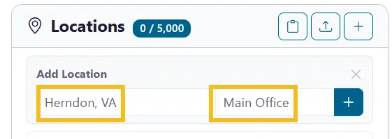
Start by clicking on the ‘+’ icon and then type an address, city name, or coordinates (latitude, longitude) into the location input field. Optionally add the ‘Name’ field and/or press Enter or click the blue add button next to the entry fields.
You will see the result of your entry appended to the locations list below as a site to be tracked.
Paste multiple locations
Most users will have dozens to thousands of locations and manual entry is not an option… One convenient option is cut/paste from your system clipboard. To activate this, click the ‘clipboard’ icon button to bulk-paste locations from your clipboard — the format must have one location per line. This is handy when copying a column from a spreadsheet. Note that you can comma separate the location and name to import both field settings in a single paste action. Here we are pasting in a list of 100 locations with both location data and names:
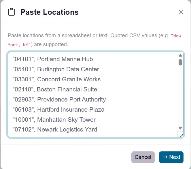
In the above example we have imported Postal Codes of our locations and the Name of the business at that location. Then next step is to confirm and adjust the data that was imported.
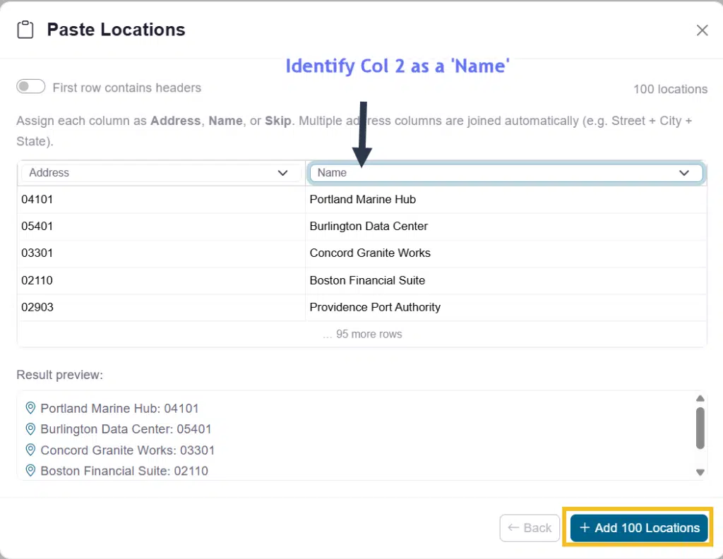
The address column is our Postal Code IDs, which are found in column 1, and we use to fetch the weather data at those locations. We then need to adjust the business name in column 2 to be our ‘Name’. Now we can finish our addition and see the updated list of locations we will use for our dashboard.
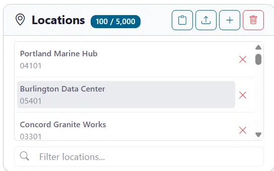
At any point we can add additional locations, rename or remove existing locations. We can see on the grid the results of our location addition. Also you can mouseover any name and it will let you know the detailed location address used in fetching the weather data. This can be helpful if you need to remember exactly where the site is located.
Import from CSV
Clicking the Import button will allow you to upload a CSV file containing your locations. This process works the same as the above ‘paste from clipboard’ operation only you will choose a file to upload first.
Clear all locations
Click Clear All to remove every location. You’ll be asked to confirm before anything is deleted.
Location limits
Your subscription determines how many locations you can monitor. The badge next to the Locations header shows your current count versus your plan’s limit (e.g., 15 / 500). If you need to increase your location limits you can do this from the ‘Pricing’ page or contact us at www.visualcrossing.com/support
3. Defining Risk Criteria
After filling your locations the second required step is for you to tell the dashboard what weather elements you wish to track and identify values at which those elements present a risk to your operation at those sites. Risk criteria are the weather rules that you enter to identify if whether a site is flagged based on its daily/hourly value as “at risk.” You can define as many criteria as you need, and each one is shown as a color-coded badge for easy identification that a threshold has been triggered.
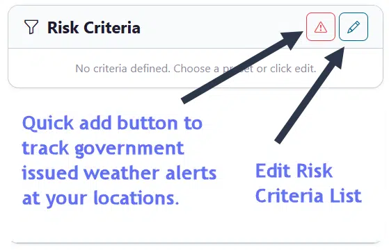
On the main screen there are two buttons to get started. The first button with the ‘Alert’ icon will add government issue weather alerts automatically as a risk value that you will track for your locations. You can also add this inside of the editor. The ‘Edit’ icon will open the Risk Criteria editor where you can begin to add to your list of weather elements and values to track.
Quick-add Weather Alerts
Use the Weather Alert toggle button to instantly add a criterion that flags any location with an active official weather alert (severe thunderstorm warnings, winter storm advisories, etc.) released by local governments.
Open the Criteria Editor
Click the Edit (pencil) button on the Risk Criteria card to open the full Criteria Editor dialog.
| Setting | Description |
| Weather field | The data element to evaluate (Temp, Wind, Rain, etc.). |
| Operator | How to compare: >, ≥, <, ≤, between, contains, or is present. |
| Threshold value | The numeric or text value to compare against. |
| Granularity | Whether the rule is checked at the daily or hourly level. |
| Criterion name | A custom label (e.g., “Freezing Risk”). |
| Color | Choose from 11 colors for visual distinction. |
As we open the criteria editor there is a “Quick Start” area at the top to quickly add typical risk criteria for your industry. In this example we will choose the “Construction Work” preset which will add 4 criteria to our list and fill in all of our settings listed above. All of them are editable by the user.
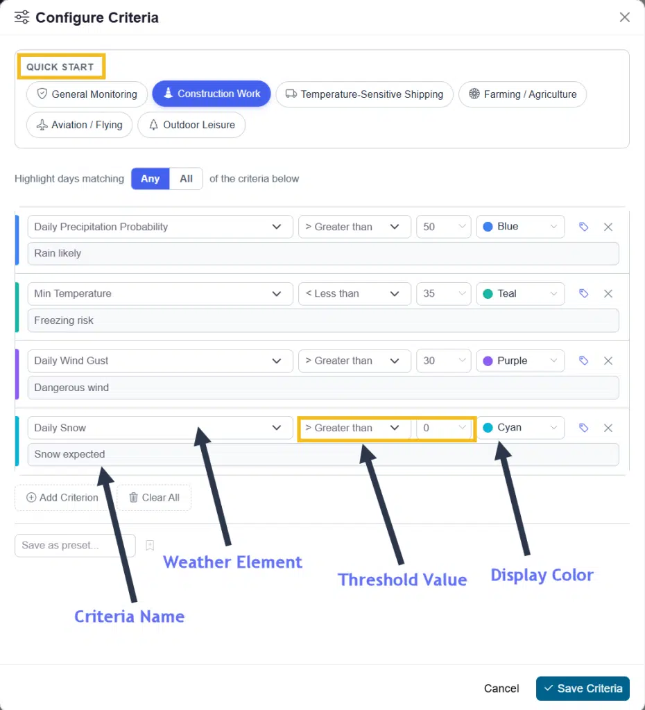
The most common edit is choosing a proper name that you can easily identify on the dashboard. For instance if “Freezing Risk” is better named “Concrete” to identify that your concrete pouring dates may incur a freeze, you can rename it as such. When we see our final dashboard you can optionally go back and edit these to optimize your view.
Available Weather Fields
- Temperature: Max, Min, or Hourly Temperature.
- Precipitation: Amount, Probability, Snow, or Snow Depth.
- Wind: Wind Speed or Wind Gust.
- Other: Humidity, Conditions (text), Severe Risk, and Weather Alerts.
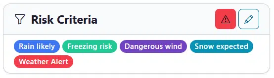
You can choose to add more, create your own preset list or click on the ‘Save Criteria’ button when you are done. We can now see the legend for our dashboard which represents the weather alert warning and all 4 of our construction criteria that were added.
4. Setting the Forecast Period
The Date Range card lets you choose how many days ahead to analyze:
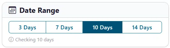
| Button | Period |
| 3 Days | Today + 2 days |
| 7 Days | Today + 6 days |
| 10 Days | Today + 9 days |
| 14 Days | Today + 13 days |
The Date Range can be updated at any time, but it will require a refresh of the data after selection as other editor changes will also require.
5. Business Hours
If your operations only incur risk during certain hours, you can enable Business Hours to restrict hourly risk evaluation to your working window. Currently the business hours setting ONLY affects the ‘Hourly’ view on the calendar grid view, it does not affect ‘Daily’ risk assessment as that is completed on daily weather values that are aggregated from midnight-to-midnight each day. Overnight risk thresholds will still be color code for daily values but will not appear in the business hour filtered view.
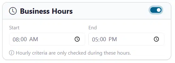
- Toggle Business Hours on.
- Set the Start Time and End Time.
- Hourly criteria are only evaluated during this window.
- Hours outside business hours are visually dimmed in charts.
6. Running the Analysis
Now it is time to submit our Tracker Definition to the weather server for live data and begin our analysis. There are a few controls to be aware of.
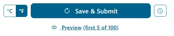
Preview (client-side)
Click Preview to run the analysis locally for the first 5 locations only. This is a quick way to verify your criteria without asking the server to process hundreds or thousands of locations.
Save & Submit (server-side)
Click Save & Submit (or Refresh Data) to process the full list. A progress bar will show the status of the job. This button will also save your Tracker definition for later edits and changes. NOTE: After you click submit the very first time, it will prompt you to rename your tracker and add notes so that when you load this tracker in the future you can easily identify it. All future save/submit actions will immediately retrieve the data. If you need to change the name in the future, you can use the “Load” operation at the top of the editor section.
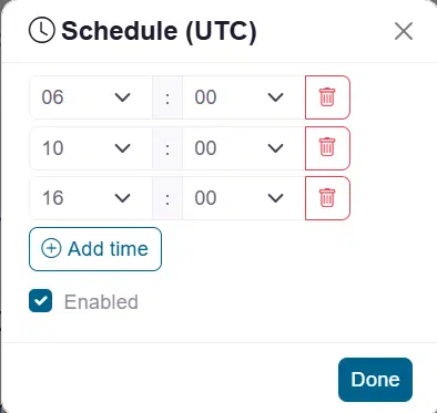
Schedule (server-side)
Clicking on the ‘Scheduler’ icon will tag this tracker for being run as a scheduled job similar to what you will find in our Query Builder tool. This will ensure that your job is complete and refreshed at a specific time each day. This is particularly useful when sharing a read-only copy of this tracker with your team. While they don’t have the ability to edit the definition or refresh the data manually, this will ensure that they have a recently updated Tracker to begin their analysis each day.
Note: Set up to 4 daily run times (UTC) for automated updates.
7. Results Dashboard
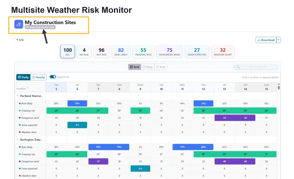
When your data submission task is complete you will see your risk tracker in action. The primary goal of the tracker is to give you a single glance view of all of your sites and what weather risks are coming in the forecast. The color values will highlight what risks and on what days each site is at risk.
There are two main sections to the dashboard, the top Filter Cards which allow you to filter the main view which is your Forecast View. The Forecast view has a variety of settings to optimize your interaction with the dashboard.
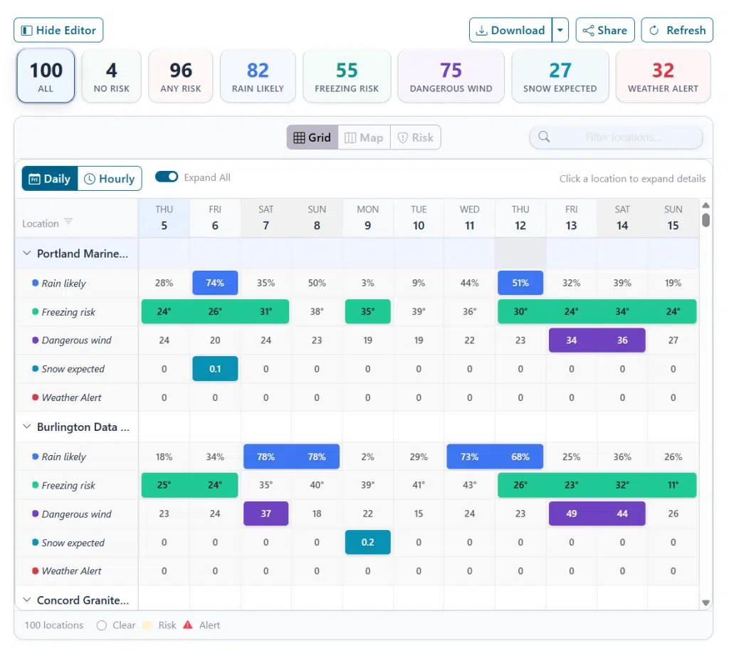
Filter Cards (KPI Row)
At the top of the results panel, click any summary card (All, No Risk, Any Risk, or specific criteria) to filter the list below. Clicking on any one of the cards, will immediately filter all views by that criteria. This allows for a faster evaluation of risk areas.
Forecast View (Main Calendar View)
The main section is dedicated to giving you a calendar forecast view of all your locations with highlighted risks. There are several view modes that you may find useful while doing your analysis.
View Modes
- Grid View: A matrix of locations vs. dates. White cells are clear; colored cells indicate that the risk criteria that you defined was triggered for any given day or hour.
- Expanded – This toggle on the grid view will show an expanded grid with actual daily/hourly values OR it can be collapsed to only show colors of your risks in order to allow you to scroll through more locations in a faster analysis time.
- Daily/Hourly – This switch allows you to view by day or hour. If you applied a business hours filter it will be applied here and only show risk during business hours. This action is a great option to drill down into a given day’s risk by hourly details.
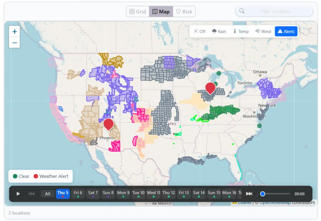
- Map View: Interactive map with color-coded markers (Green = Clear, Color = Risk). Note that the map is also filtered by the KPI Cards so only a portion of your locations will show as pins. However the map will show small green dots for locations that were filtered out. Also remember that
- Layers Control – To further add intelligence to your map view it was equipped with a layer toggle control that allows you to add: Precipitation Radar, Temperature, Wind Fields and Weather Alert areas (as shown below filter by Alerts):
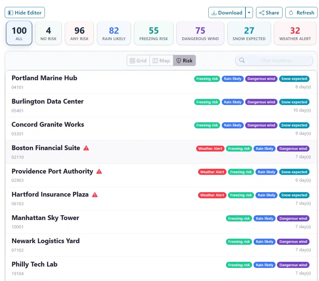
- Risk List View: A scannable list showing specific badges for each triggered criterion. This list was designed for export reports and quick views of sites that have risk. This is easy to print and manage without the need for a full screen to view or scroll through.
8. Site Detail View
There are many ways to drill down to the Site Detail View. On the main grid view you can click on any detail cell value, on the map view you can click on any site pin and ask for a full report and on the risk view you can click on any location showing in the list. These actions will take you to a full detail weather report for that location which includes daily/hourly views, weather alert reports and forecast visualizations. These reports are interactive and can greatly assist in gather a full weather assessment of a site at risk.
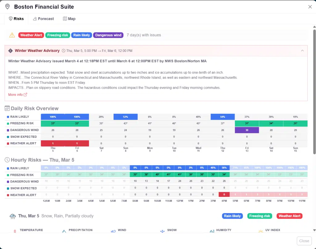
Tab 1: Risks
Shown above, it details active weather alerts, a Daily Risk Overview, and an Hourly Trend Chart.
Tab 2: Forecast
A day-by-day expandable forecast with weather icons, high/low temps, and hourly breakdowns.
Tab 3: Map
A single-location map centered on the selected site with available map layers to track radar, wind, heat and other elements on a detailed map area.
9. Saving, Loading & Scheduling
Your Tracker is just one of many that you can create. The system has a full object infrastructure which allows you Create New, Save, Load, SaveAs and Delete old dashboards. The controls for this are found at the top of the editor mode:
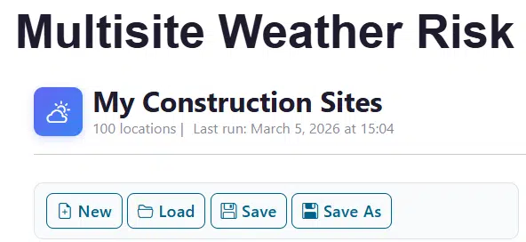
- New: Start fresh with a new Tracker definition
- Save: Update a tracker or “Save As” to create a copy.
- Load: Access saved trackers and see their last-run status.
10. Sharing Results
There are multiple ways to share the results of your analysis. The primary options are to Download or send a Share link.
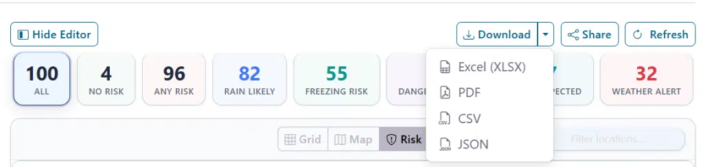
- Download: Create a physical, portable file instance of your risk list that you can send out to other users in various formats:
| Format | Best For |
| XLSX | Spreadsheet analysis (Excel/Google Sheets). |
| Formatted reports for printing or email. | |
| CSV | Universal data format for other tools. |
| JSON | Programmatic access/integration. |
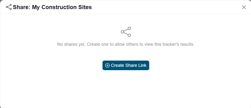
- Share: Allow accessible users to get a link to a live, view-only tracker.
Click Share->Create Share to create a read-only link. This editor will walk through the process of creating a link to share with known account users or an open, public link that you can share with users covered by your license.
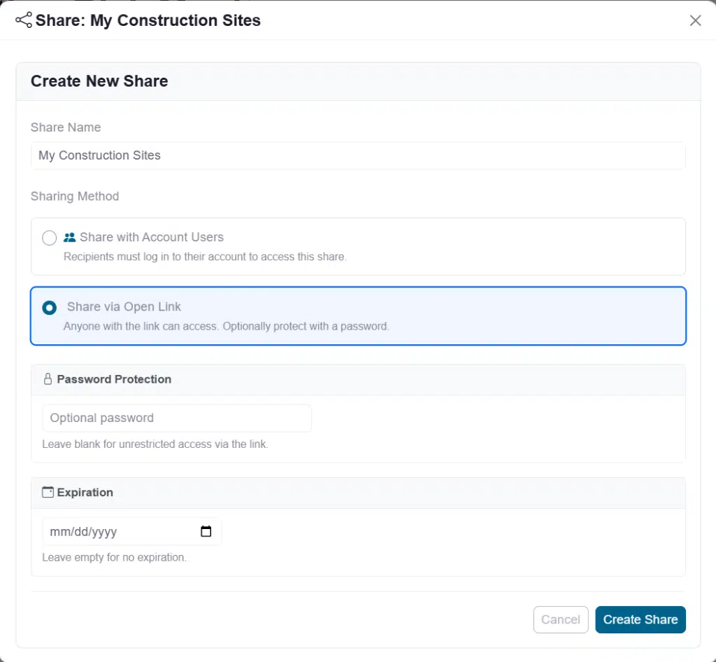
Notice that you can add password protection to ensure only authorized users can see the risk status as well as set an expiration date for time-limited shares. Users that receive this link will see the latest data completed either by the admin/creator of the tracker or the scheduler if one was set up. Here is the read-only view for shared users:
11. Tips & Best Practices
- Use the Preview: Always test your logic on 5 sites before running 500.
- Strategic Colors: Use high-contrast colors (Red for “Danger”, Yellow for “Caution”).
- Display Only: Use the “display only” operator to see data in the grid without it triggering a red “Risk” flag.
- Shared Open Links: Use these for field teams so they don’t need their own login to see daily status.
For additional help, contact Visual Crossing support or visit the Visual Crossing Weather documentation.