

Reading datasets of weather patterns may not necessarily help a user visualize and understand the impact of different weather information, which is why Visual Crossing offers numerous ways to model data using our weather API.
This article will provide an overview of the ways you can visualize data using Visual Crossing, helping you customize your own weather data to match your organizational needs.
Which Types of Weather Data Can I Visualize?
Almost all weather data available in the Visual Crossing weather API can be visualized, enhancing your analysis with a data-appropriate image tool.
We provide the most accurate historical, current, and forecast weather data. The visualizations we support include:
- Temperature – You can use time series data to show the changing temperature throughout the day or provide a spread of the temp ranges on a given day. This can help contextualize hot or cold temperatures.
- Precipitation – Show the chances of rain based on historical data on a day or on an hourly basis.
- Snow – Assess the likelihood of snow, as well as how much may fall in a given time period.
- Wind Speed – Help users understand the risk of severe windstorms using real-time radar and graphs.
- Cloud Cover – Satellite imagery of the contiguous United States demonstrates the trends in cloud cover, which is especially helpful for would-be astronomists.
- Humidity – Visualizing this dataset helps alert users to the potential of heat stroke when humidity levels reach a certain point.
- Solar Energy – This is one of the most important data sources for energy companies, dynamic maps of solar energy help identify energy output for transmission lines.
- Sun and Moon Phases – Knowing the sunrise and sunset for locations of interest can be incredibly helpful to those who want to maximize their sunlight hours. Helpful animations also provide moon phases.
- Weather Stations – In some instances, such as for a company that has multiple locations, knowing which weather station is reporting what details can be quite helpful. You can explore the various weather reporting stations on a map to get a better understanding of where the forecasts are coming from.
Climate Data Visualization Options
Just as there are numerous programming languages you can use to design software, there are numerous ways to analyze weather events and present them to your audience.
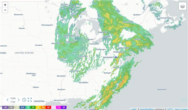
Weather Maps
Maps are a highly effective way to demonstrate the spatial connections between different data points, which are vital if you need to show data for a large location. If your business uses or plans to use the business intelligence software in the future, we also offer our weather maps in MicroStrategy.
Analytical
Whether you’re working with precipitation or other datasets, you can quickly generate embedded macro labels that link across layers, which can then be exported through a gridded NetCDF file for greater convenience.
Insightful
If you have large datasets that must be analyzed, a weather map can help. It’s possible to immediately generate different visualization options through basic filtering, which allows you to review your data from multiple angles.
Intuitive
You can decide which presentation works best for you, and then export images in your preferred format, whether that is Bitmap images or postscript graphics files, for picture-perfect presentations every time.
Scalable
If you need to look at weather patterns for the whole of the United States, that’s entirely possibly with Visual Crossing weather maps. You can examine thousands of data points from a variety of layers with the click of a mouse.
Weather Charts
The weather data from Visual Crossing can be represented using almost all possible export options. You can analyze weather forecast data in Google Sheets to create numerous color tables for immediate viewing by other researchers, or you may chart weather data using PHP, which can parse an Esri Grid ASCII file.
Weather Dashboards
Sometimes, you may need to keep track of data in real time across a variety of devices. For example, you may have agricultural workers who need to keep track of soil temperature and UV radiation.
In this instance, you can build a weather dashboard using the Visual Crossing API, creating a valuable application for weather data. While you can use any data set available from our API, common ones include the high, low, and average of temps, precipitation, and solar energy.
Visual Crossing Visualization Features
Visual Crossing API is robust and highly customizable. Our API provides accurate real-time data on numerous different metrics, in addition to historical datasets, to provide depth to your analysis. Features include:
- 50 years of historical data
- 15-day forecasts
- Sub-hourly data
- Current conditions
- Worldwide coverage
- Location geocoding
- Weather alerts
- Astronomy data
- Energy forecasts
- Agricultural data
- Maritime wave and swell
Worldwide Forecast and Historical Weather Data
Even if you only work in one location, having a satellite image worldwide weather forecast can be incredibly useful. Seeing a map of current weather conditions elsewhere will help you predict potential shipment delays for international goods or prepare for large-scale weather events like hurricanes before they arise.
Likewise, historical weather data helps contextualize current conditions and predict future weather events. For example, if you are planning an event several months in advance, knowing the historical highs and lows provides you with the tools you need to make contingency plans and predict possible issues the day of.
Access Our Weather Data Documentation
Visual Crossing offers access to comprehensive weather data documentation that will meet user needs at all levels, easing the process of implementing our API into your software.
Not only do we explain what all the weather information means, but we also have specific documentation available for different programming languages to ensure that your implementation runs as smoothly as possible. Should you run into any issues, users with any pricing plan have access to forum support, where you can get answers to your questions from other professionals utilizing Visual Crossing.
Data Plans Suited to Your Visualization Needs
Our weather data pricing allows individuals and organizations at any level to access comprehensive climate data. The five tiers include:
- Free – A basic option with an API key, perfect for hobbyists.
- Professional – Best for individuals performing data science research or prototyping.
- Metered – For smaller companies or teams who only need sporadic data.
- Corporate – A great option for small businesses and research groups that will need to store and share data on a regular basis.
- Enterprise – With unlimited records and full-service support, this is a perfect choice for larger organizations that need continuous access.
Get Accurate Weather Data With Visual Crossing
Using quality data from the National Weather Service and other organizations, the Visual Crossing API has visualization tools to match all weather parameters and commercial needs.
Our platform-independent software offers weather data visualization for any functionality, allowing those using any language or platform to access just the right amount of detail for their needs. Whether you are a citizen, scientist, or an industrial farmer, Visual Crossing can help you achieve your goals with superior weather maps and highly responsive service.