

How to analyze business data using historical weather records
In part one of this series, we discussed how to find weather data that works well with business intelligence analysis and tools. That article focused on finding a provider that provided a clean, well-documented API for querying weather data, provided data in multiple formats that are compatible with all BI systems, and delivered weather records that matched well with the details of business data. If you have not already read that article, you would be well-served to do so before continuing here.
In this article we will continue where part one stopped. Once high-quality, BI-friendly weather data has been found, we next need to understand how it can be used to analysis historical business data, Most business intelligence systems have a warehouse containing years of business records including locations and dates. This article will show how to match those records to weather data and identify useful patterns and trends.
Then, in the third and final article in the series we’ll discuss how to apply the lessons learned from historical data. Weather forecasts can be used to make intelligent decisions in both the short-term and long-term processes of the business. But before we can apply the lessons learned, we must match the historical business data with weather and use use BI analysis to find those patterns.
Finding patterns in business data using historical weather
The first part of analyzing external data in business intelligence is joining the datasets together based on common attributes. After that, we can then begin to find correlations between the datasets. Sometimes these correlations are obvious and other times they are more subtle, but all can be valuable. In many cases patterns will show themselves with normal graphing and dashboarding techniques. However, for more subtle cases, we will discuss using custom correlation metrics and graphs. These can be used to tease out data details that otherwise remains hidden in simple, visual analysis.
Joining business data and weather records
If we did a good job of finding a compatible weather data provider in part one of this series, we have identified a weather data provider whose data is directly compatible with our business intelligence system. Excel is one of the most common data analysis tool in the world and is often used for BI applications. Beyond that, many enterprises uses more sophisticated BI tools such Tableau, SAP, Power BI, or MicroStrategy. These tools each have their own specific ways configure data joins. In this overview, we’ll discuss the most common joining techniques.
The key to getting a clean weather data join, as with any join in BI, is to join the data on a unique key. In part one of this series we hopefully choose a data provider that allows us to pass a unique ID along with every query. If done properly, this gives us a very easy criteria on which to join.
One way to do this in Excel is by putting your business data in one sheet and your weather data in another. You can then use a combination of the INDEX and MATCH functions to join the data. You use the MATCH function to look up the appropriate weather record and then the INDEX function put the weather metrics into the business data sheet. These functions even work in an array mode to manage multiple criteria. If you are more familiar with the LOOKUP family of functions, you can use that in a similar way. Whichever approach you prefer, the key is at the end of the process you will have a single sheet combining both the business data and the matching weather records.
Visual Crossing Weather makes this easy for Excel users by providing providing Excel’s native format XLSX for results. Note also that this same join technique applies equally to Google Sheets, OpenOffice’s Calc spreadsheet and similar spreadsheet tools as well. However, in those case you might want to use Visual Crossing Weather’s CSV result format instead even though most can read XLSX format.
However, an even better way to merge weather with business data in Excel is by loading matching weather records via URL API calls. Excel can directly call Visual Crossing Weather’s servers to obtain the weather record that matches each row of business data. You can do this easily by following the steps outlined here in this article: https://www.visualcrossing.com/resources/documentation/weather-data-for-excel-and-google-sheets/parameter-based-web-queries-in-excel/. This technique and Power Query allow your workbook to automatically load updated weather data dynamically to match both historical records as well as new business data as it arrives.
More sophisticated business intelligence tools often have a more clever process of combining business data with external data. Some common terms used are “data wrangling,” “data joining,” “data blending,” or “combining data sources.” However, all of these terms typically lead to a wizard that will guide you through the joining process. Consult the documentation for your favorite BI tool to find the right option. Below are some example dialogs from common BI platforms.
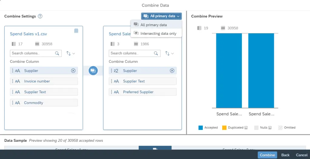

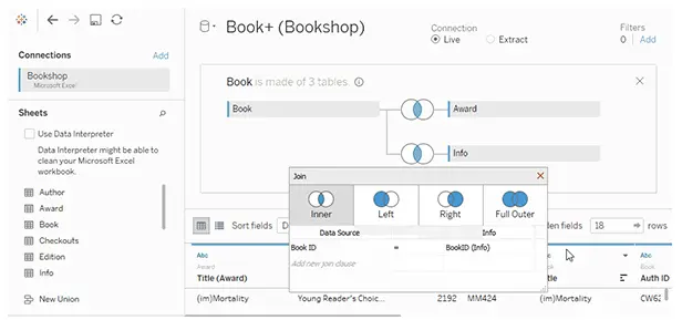

Once you have gone through the joining process in your business intelligence tool, you will be ready to use the data for analysis.
Finding patterns
Now that the business data and weather data have been joined, we are ready to compare them. One of the easiest ways to do this is via dashboard visualizations. To get started every BI tool can make a graph comparing business data metrics with weather metrics. You can use this technique to step through the weather variables and business variables to see how they correlate visually. Below is an example of a simple, visual correlation graph in Excel.
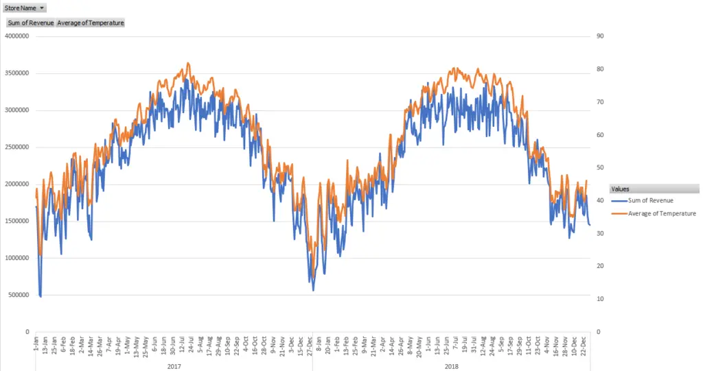
Often times you will see specific spikes in the data or specific valleys that match up with a weather metric. For example, brick and mortar retailers often have a strong correlation with temperature and precipitation. People are less likely to go out to shop when the weather conditions are encouraging them to stay warm and dry inside. However, other types of businesses are often the beneficiaries of this tendency. Online retailers are a perfect example as are streaming video services. Thus it can be said that many retailers have a reverse correlation to precipitation. That is, more rain means fewer customers out and about and less business. Streaming services, on the other hand may have a direct correlation to precipitation. This is, more rain means that more people stay home and watch more videos.
However, as you drill into the data and the weather metrics you will likely find more complex patterns. Above we mentioned streaming services. In one analysis a popular streaming service found that the length of videos watch was tied to weather conditions as well in a somewhat unusual way. They found that inclement weather conditions triggered a spike in streaming long videos while pleasant, outdoor-quality conditions caused a viewing spike as well, but this time in short videos. Upon further investigation, it was determined that the inclement spike was due to people staying home and watching movies and other long-form content on a big screen. That is something one would naturally assume. However, the spike is short-form content was determined to be due to people being outside or travelling, enjoying the nice weather and watching or sharing short video clips on mobile devices.
Retailers are often also surprised by interesting and unexpected weather correlations as well. You would already assume that rain would trigger a spike in umbrella sells while the first snow of the season would cause customers to buy boots, sleds, and related accessories. However, retailers have found other correlations that defy easy explanation. For example, one major grocery chain discovered that bacon sales are correlated with temperature. Lower temperatures signal higher bacon sales. Even people who have been working in retail their entire career could be surprised by this finding.
By using this simple comparison technique, it is almost certain that you will learn something new about your business data and customer tendencies.
Correlation metrics, matrices, and graphs
The power of a business intelligence tool is its ability to crunch huge volumes of data and find patterns on its own. This is done by a process known as correlation, and every popular BI tool has this functionality. The result is a correlation metric or correlation matrix that shows correlation coefficients. These coefficients describe the relationships between variables in the data. In the case of weather, we want to know which weather variables correlate most strongly with our business metrics.
The value range of a correlation coefficient is typically 1 to -1 and the higher or lower the value, the stronger the correlation. For example, we would expect to see a high correlation coefficient (closer to 1) between hot summer days and sunscreen sales. This means that customers are strongly inclined to buy sunscreen on hot, sunny days. And we would expect to see a low correlation coefficient (closer to -1) between hot summer days and the sale of heavy coats. While some people are planning a ski vacation to the mountains during the summer, most people are not thinking about cold weather attire at all. So few coats are sold resulting in a high negative correlation. A correlation coefficient near 0 tells us that there is no identifiable relationship between the data values. As an example, this may be the case for the sales of a product such as dish washing soap that is used equally all year in all weather conditions.
Excel, for example, can easily produce a correlation matrix across data, and there are various tutorials on the internet to show the process. Here is a good example if you want to follow along: https://www.datasciencemadesimple.com/create-correlation-matrix-excel-correlation-table-excel/. The result is a table of correlation coefficients that is automatically calculated by the analysis tool. Power BI can be used in the same way and can also incorporate R code and correlation extensions to provide additional power and functionality.
Similar functionality is available either via correlation metrics or correlation matrices in nearly all BI tools. Tableau has a tutorial for calculating correlation matrices, SAP has various predictive analysis functions, and MicroStrategy has built-in statistical functions to calculate correlation metrics. In addition, you can also use correlation graphs in many BI tools. For example, scatter charts and bubble charts can be used to quickly plot the correlation between two metrics.
Finally, as we mentioned above in relation to Power BI, many BI tools and analysis systems can be extended by using common R scripts or custom statistical packages. This functionality is specifically designed to find correlations and data patterns in powerful and sophisticated ways. While specific discussions are outside the scope of this introductory article, check with your BI provider and documentation to see what is available in your tool.
Next in Part Three…
Now that we’ve found some useful and actionable patterns and correlations between business data and weather, in our final installment in this series, we’ll discuss how to use weather forecasts to apply what we’ve learned to make intelligent business decisions.