

Does weather affect my business? This seems like a simple question but as many of us have quickly learned, it is not a simple task. I have performance data for a set of stores and I am pretty certain that weather has been affecting my business, but I need create an analytical sheet to be conclusive. The problem is that I have never had a process in place to capture weather data every single day and get it into my worksheets or my database. I would need to find a source for years’ worth of weather data at dozens of locations that I can join to my business data. This raised at least a dozen questions, here were the most important:
- Who has this data and how much does it cost?
- What data do I need to join my location addresses to the weather locations?
- Is there any way to automate it or am I left with cut and paste?
- Is the data available at the day level or only hourly? Do I have to further process the weather data?
- Most importantly, can it conclusively tell me if weather affects my business?
I will answer these questions below as I go through my test. I will highlight it with “ANSWER” and the number of the question.
Upon initial investigation, there are sources of weather but typically by Zip Code. I would be required to restructure my locations data into zip codes. Additionally, I would be required to pay for zip-based dataset and join the data into my worksheets. In the end, I am not certain that Zip Code data is accurate enough.
I have concluded that for this first test I would try the Excel Weather Add-in available on Microsoft AppSource. I started by downloading the Weather Add-in by Visual Crossing. I signed up for a full subscription account, but you can also sign up for a trial if you are ok with trying this on less than 100 rows of data.
Step 1 – Loading Weather data into Microsoft Excel
My initial Google searches provide several mainstream sites from well-known companies such as Weather Underground that would allow me to enter in a location and get a month’s worth of data for my locations. It even allowed me to enter in my address and it would translate it to the nearest weather station to give me the weather that was at my location for each day. If I went down this path it would take quite a long time to cut, paste, filter all of the necessary data. There were sites that offered to join my data for me if I sent them my spreadsheet. The costs for this was not published and I am certain this is one of the times when it probably exceeded my budget and it probably didn’t fit with my need for controlling this process by doing it myself. This made my choice easy to start with the Weather add-in.
The Weather add-in automatically sends off each of my dates to a server where it is joined and interpolated for accuracy against National Weather Service data. All of the costs for the source data were included in the cost of the add-in. I could join as often as needed. The data is significantly better in accuracy than a simple join based on address or zip code, it is interpolated and intelligently constructed by data from multiple weather stations as needed.
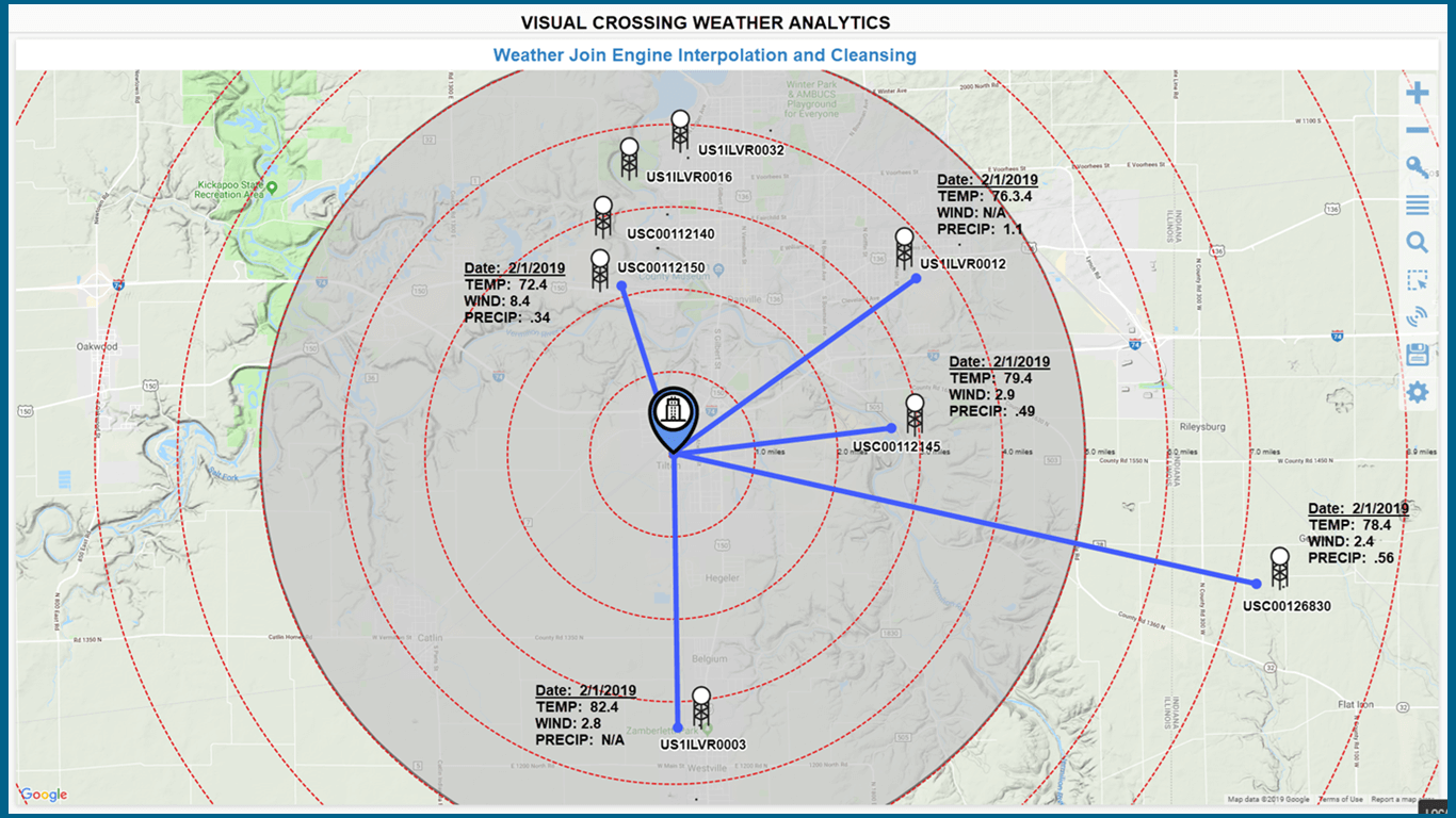
ANSWER (question 1) – There is no additional costs for the provided data and it is the same NWS data that all forecasters use to create their models so it the quality level is quite good. The source of the data is free, but the cleansing and interpolation are functions provided by the add-in. The image below shows how a single location could be matched to multiple weather stations nearby. It also emphasizes why interpolation and cleansing is necessary.
Step 2 – Joining Weather Data to My Data
I already installed the Weather add-in so I’ll open up my Excel worksheet and open the Weather add-in by clicking on the Weather menu. The worksheet will look like the following image with the Weather add-in on the right where we will tell it what data to join.
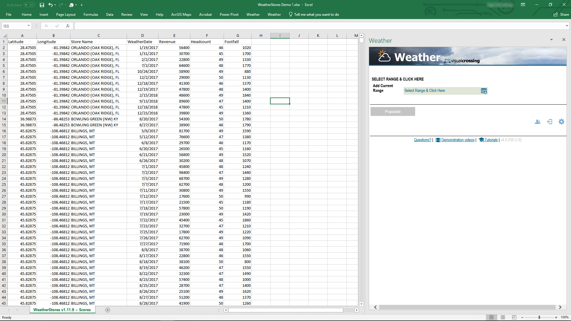
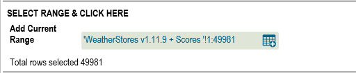
We need to give the Weather add-in a range of data that includes Locations in the form of Lat/Longs or addresses as well as dates for matching historical data. At this point we can click on the corner to select the entire worksheet, a set of columns or a specific range of values. I have almost 50,000 dates to match and I will select the entire range.
My dates are at the day level and they are found in the ‘WeatherDate’ column, so I will assign that column as my date and choose the Historical weather option because my dates are in the past.

Next, I will choose my locations for which I can assign my ‘Latitude’ and ‘Longitude’ columns in my range.
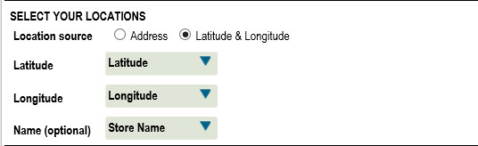
ANSWER (question 2) – I just need an address column or latitude and longitude. I don’t need to match up my locations to weather stations, this is handled by the system.
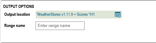
Finally, I will choose the column I would like to add the weather data to. This can be anywhere in my workbook.
By clicking on the Populate button, the Weather add-in will start joining the data. See below how it has added the weather for every date for every location.
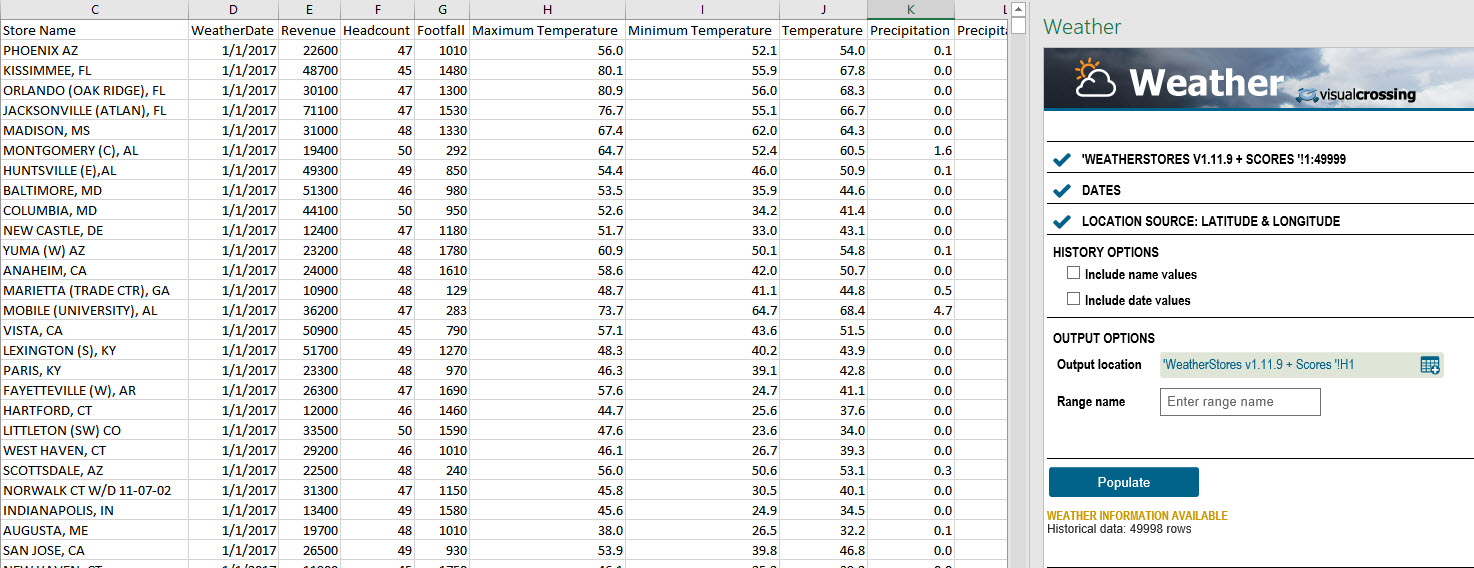
ANSWER (question 3) – The data is automatically put into a column that matches my locations and dates as expected. 50,000 rows took me about 4 minutes to populate. I found that I could also put the data on another sheet or area of my worksheet and reference it as a range of data.
ANSWER (question 4) – From looking at the temperature and precipitation values it looks like it has auto-aggregated the avg temperature for day level and took to total for precipitation. No further processing on the data is required for my day level data.
Step 3 – Analyzing Weather Data
We are done with the join and ready to answer my last question… does weather affect my business? I am going to start by doing a simple visual analysis and put weather on a performance graph with my revenue data to see if there are any patterns worth following up on.
To start with, I find the best analysis is done in a pivot table. Especially when working with dates and graphs, I find that pivot tables will correctly aggregate the data for each day rather than graphing 12 points for each day. I’ll select my extended dataset with weather and insert a PivotTable.
My pivot table is going to be quite simple. Date in the Rows, Revenue and Temperature in the Values and Stores in the Filter section. I chose to filter on each location because the weather in these locations can be very different and customers can respond very differently to it.
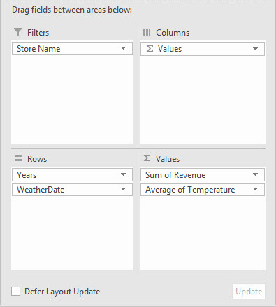
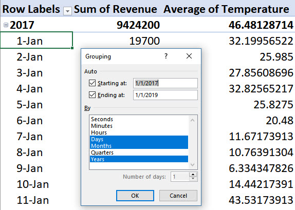
I also found it helpful to adjust the Groups in the pivot table to add Day level rather than just Months or Years. This will give me the pivot table I need to compare Revenue and Temperature by every date for the last two years.
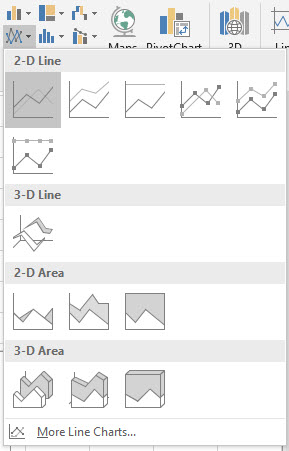
To compare Revenue and Temperature I want to start with a graph visualization. Now we can simply insert a double point graph onto my pivot table.
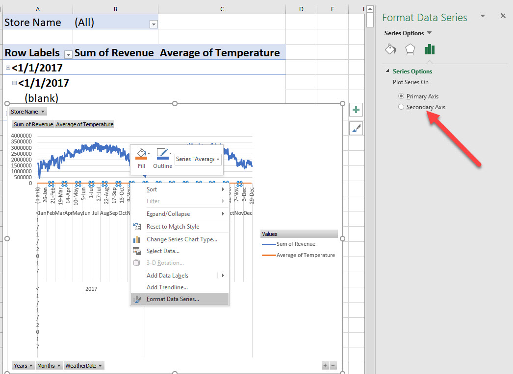
One additional adjustment to make the Temperature graph series to show on a secondary Y Axis. Revenue ranges in the 10s of thousands and temperatures are between -20 and 100 the scale of the single axis won’t help us. To do this, select and right-click on the Temperature line on the graph(orange in my case) and format the data series to use the secondary Y axis.
After adding the secondary axis, I now I have the graph that I want, and the results are pretty clear.
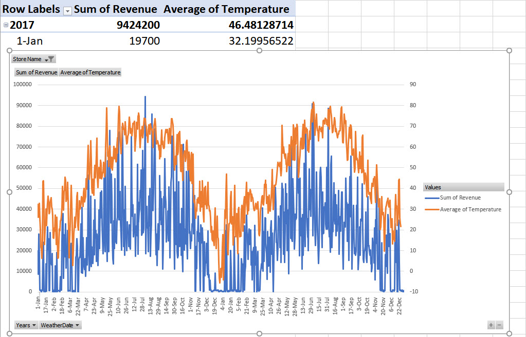
ANSWER (question 5) – Yes! Weather does affect my business and the data made it perfectly clear to me that there is a strong relationship.
My next steps would be to add true correlation functions to see how strongly the two variables are related. These graphs have made it perfectly clear for almost all of my locations that temperature makes a significant difference to my revenue. I will add more weather variables and more business metrics to see if I can find additional relationships. Finally, I can use the forecast to understand what my predicted revenue will be for the coming weeks.