

Does the number of people who visit Mount Rushmore depend on the weather? In this blog I investigate the correlation between the daily Mount Rushmore visitor counts and the weather that occurred on those days.
I was in the process of considering a trip to visit Mount Rushmore, and being a data guy, I decided to see what interesting stats might be available for our Nation’s most famous carved mountain. It turns out that the National Park Service has daily visitation information back to the 1990s. So, this seemed like a great starting point for some interesting exploration which I’ll detail in this post.
Mount Rushmore visitation data
My first step was to load this data into Excel and filter it down to include only dates since the turn of the century. (Note that I’ve uploaded an Excel file with this raw data so that you can do your own explorations, too. You can download the file here: Mount_Rushmore_daily_visitors_2000_to_2017.xlsx) In order to get a feel for the visitation patterns, I made a basic graph of visitors over time.
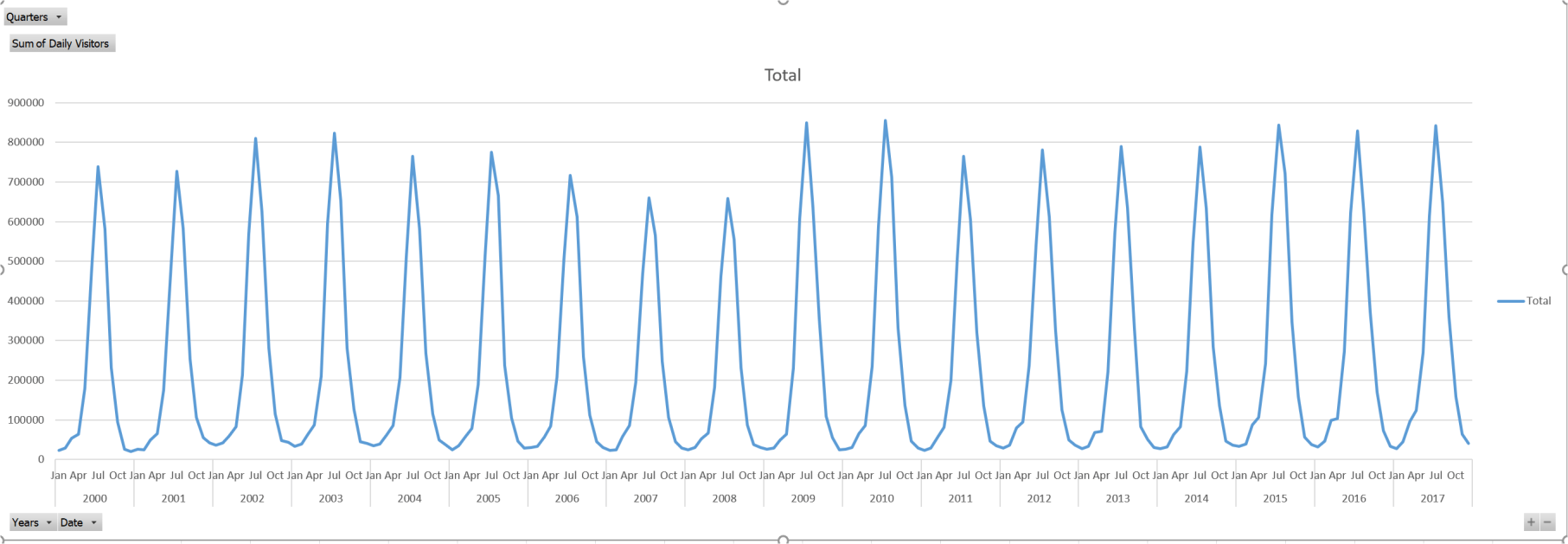
The first thing that I noticed is that there are a very sharp spikes of tourism right in the middle of summer, and the tourists drop off super quickly on both sides of the mid-summer sweet spot. The other thing that I noticed is that peak visitation rates seem to be fairly consistent over this long period with a noticeable slump during the Great Recession around 2007 and 2008.

Obviously, the tourist season and average conditions over these 18 years are fairly similar during these core summer months. So, there must be some recurring annual phenomena triggering these spikes. Then it hit me, Mount Rushmore has a strong patriotic component, and the spike in early July must be due to Fourth of July festivities. Sure enough, a quick trip to the NPS’s Mount Rushmore website shows that there are concerts and other special events every Independence Day. Sadly, the fireworks have been cancelled in recent years apparently due to fire concerns, but there are still many special events that day to enjoy. After all, what better time to visit the carved presidents of Mount Rushmore than on our Nation’s birthday?
The second “hill” in early August was more mysterious. However, a bit of Google sleuthing turned up the Sturgis Motorcycle Rally. That huge event that takes place in early August and is advertised as “only minutes away from Mount Rushmore.” It seems like a good bet that many of those 500,000+ bikers and the related assembly visit the famous carved mountain. So that explains the other oddity in our data.

Thus, in order to remove these “unnatural” and periodic spikes, I decided to let Excel filter away the early days of these months. This allows me to capture the heart of the vacation season while ignoring the spikes caused by special event traffic
The Weather
It seemed logical that the weather should play a rather important role in determining the daily attendance at Mount Rushmore. After all, rainy weather would likely make it unpleasant to walk around outside to look at the mountain and would give the mountain a dreary appearance. And when it is too overcast, it might be difficult to see the mountain at all. So, my next step in the analysis was to add weather data to my historical attendance records.
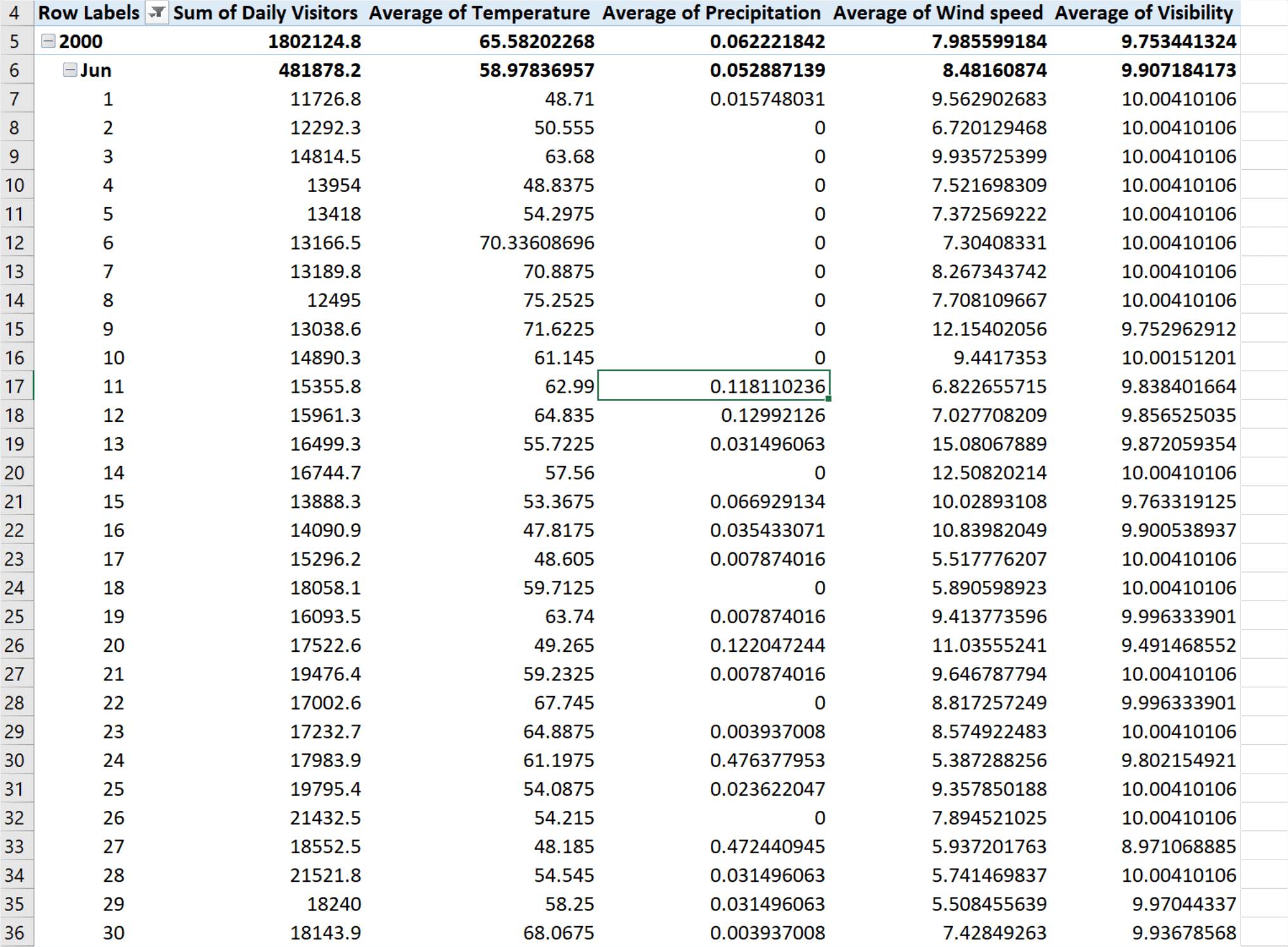
The best way to add weather to any Excel workbook is via the Visual Crossing Weather add-in. You can download a free trial from the Microsoft App Source store here: Visual Crossing Weather add-in. Once installed, this add-in will read the date and location information from your Excel sheet, lookup the matching weather records, and add various weather metrics alongside your existing data. Among the most interesting metrics for our analysis are temperature, precipitation, wind speed, and visibility.
After installing the add-in, you will get a new menu option named “Weather” at the top of your Excel. Selecting the Weather menu opens the ribbon of options that includes that Weather widget. Clicking on the Weather widget opens the Weather panel on the right-hand side of the Excel window. After that, the Weather components works similarly to a graph. Simply select the range of data that you want to analyze, and Visual Crossing Weather will augment your sheet with the appropriate weather metrics.
For this analysis I selected all of the columns on the sheet including my location information and the dates. By default, Visual Crossing will select an historical weather analysis when it sees the date information. So simply hitting the Populate button caused Visual Crossing to add the appropriate weather data to my sheet. In order to make sense in a pivot table, I need to change the weather metrics to averages, and then I was ready to do some weather analysis.
One of the most interesting types of analysis that we can do with weather data is a correlation analysis. That is, I would like to know which weather variables most strongly correlate with our “business” values. In the case of Mount Rushmore, our “business” value is the number of visitors each day.
Excel provides various ways to analyze the correlations, and the first that I considered is via the scatter chart. A scatter chart plots each observation of one data set against its matching observation in another. The clustering and density of the match points show the hot spots where the attendance values match with a given weather metric.
I decided to start by having Excel generate the scatter plots matching Mount Rushmore attendance against each of the interesting weather metrics. I’ll put the graphs below and then discuss each of them briefly.

It looks pretty clear from this scatter chart that most of our data points happen along the zero line (bottom of the chart). That signals that most of the days in our selected summer range have little or no rain. Beyond that, however, there is some indication that days with meaningful rain (higher on the chart) tend to only have points closer to the left of the chart. Put another way, the days in our dataset with meaningful rain tend to not be the days with the highest attendance. However, the correlation does not seem very clear or strong.
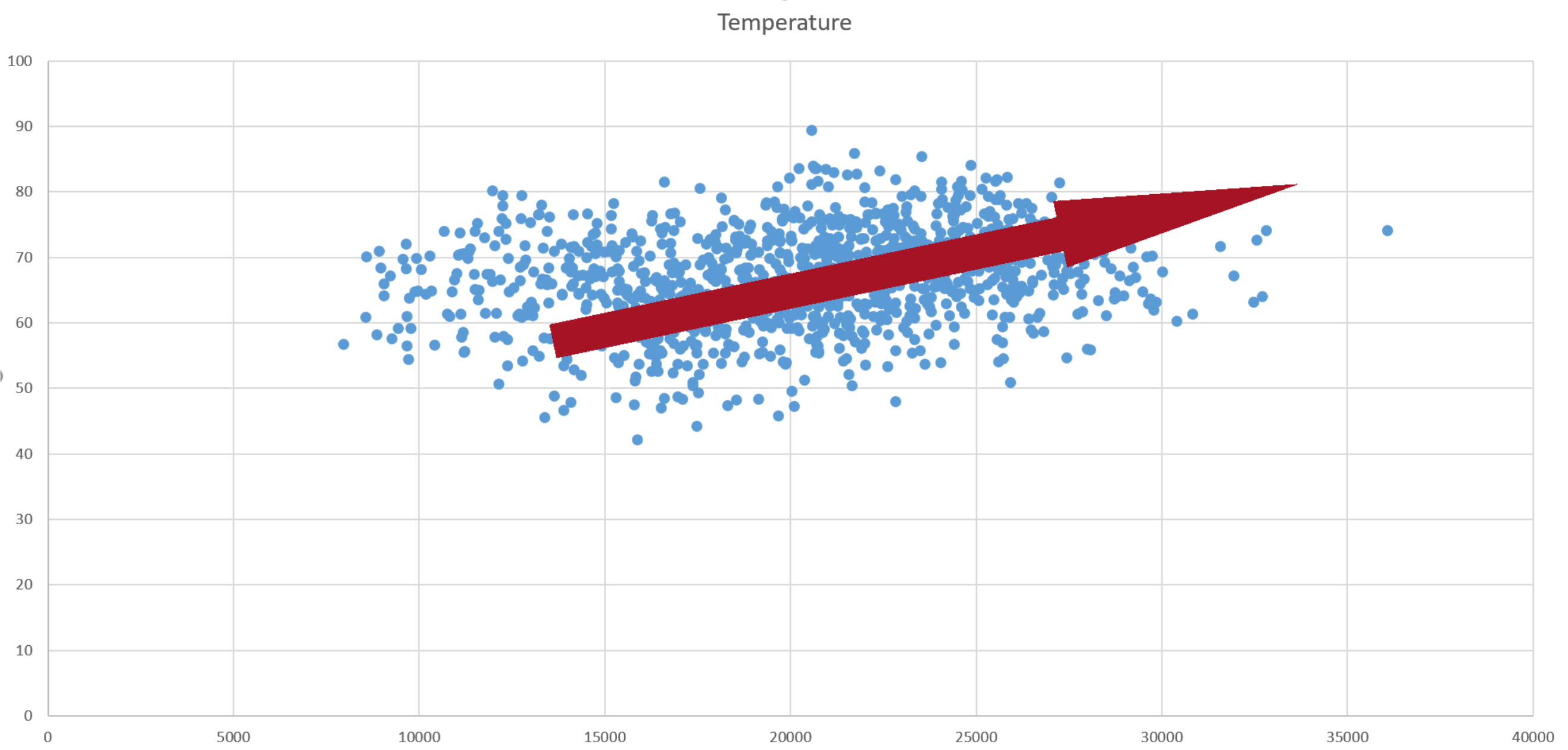
The next comparison is to temperature. In this chart it is possible to see a trend on the cooler days as well as on the highest attendance days. Put in more visual terminology, the dense area of points is moving up and to the right. The cooler days (closer to the bottom of the graph) are in the lower attendance areas while the highest attendance days are squarely in a sweet spot range between 60 and 80 degrees.
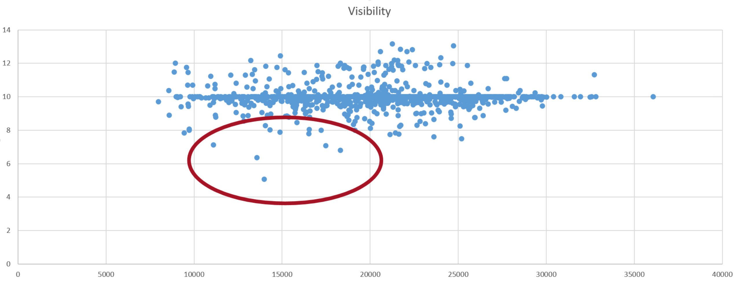
This is the chart that I expected to show the strongest correlation. After all, who wants to visit Mount Rushmore if the mountain is obscured by haze and clouds. As a prospective visitor, the good news from this chart is that there are very few low visibility days in the summer season. It appears that 10-mile visibility is a standard reporting value, so the preponderance of data points cluster along that line. However, you can see that the few low visibility days that did occur match with decidedly lower numbers of visitors.
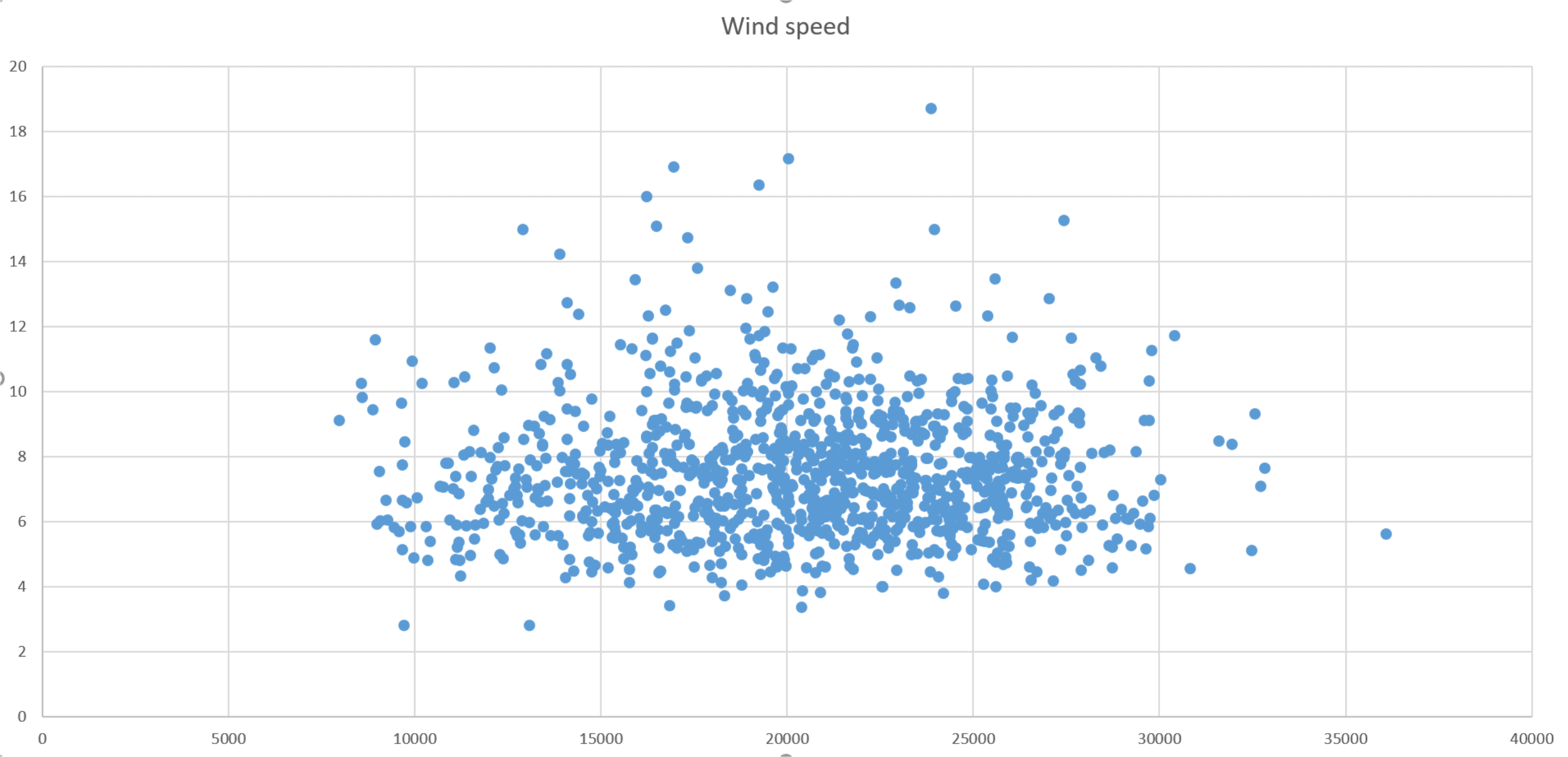
The final chart shows wind speed. From this chart, it appears that there is often some wind around Mount Rushmore. However, even on the windiest days, the number of visitors seems to be around the middle of the pack for attendance. So, it appears that there is no visible correlation between wind speed and Mount Rushmore visitation.
There is another way that Excel provides to track correlation. And that is via its built-in CORREL() function. This function takes two ranges of data and calculates a simple correlation metric between the two sets of values. The result of this calculation is a number between -1 and 1. A value of 0 indicates no correlation. The closer the value is to +1, the stronger the positive correlation. A positive correlation means that the input ranges rise and fall together. The closer the value is to -1, the stronger the negative correlation. A negative correlation means that as one input range falls, the other one rises and vice versa.

As was seen visually from the scatter charts, the strongest correlation by a large margin is temperature. Since there are almost zero extremely hot days in our data, there is little concern that visitor got scared away by high heat. So, the warmer it is around Mount Rushmore, the more visitors the mountain attracts.
Notice that the precipitation correlation is mildly negative with the bar descending below the zero line. That would be expected, of course, since rain would likely keep people from visiting. Also, as was predicted from the scatters, there is a weak correlation to visibility and almost no correlation to wind speed.
The Forecast
The final question is how to apply these correlations to the future. In order to do that, I used Visual Crossing weather in forecast mode. In this mode, I can get a daily or even hourly forecast for any locations that I have in my Excel sheet. In this data set, I’m only analyzing a single location, Mount Rushmore, but if I had other locations to consider or compare against, I could get the forecast for them just as easily.
In order to obtain the forecast, I copied a single row from my Mount Rushmore historical data and pasted it into a new sheet. Then I selected the latitude and longitude and let Visual Crossing Weather populate the weather details for the week ahead.
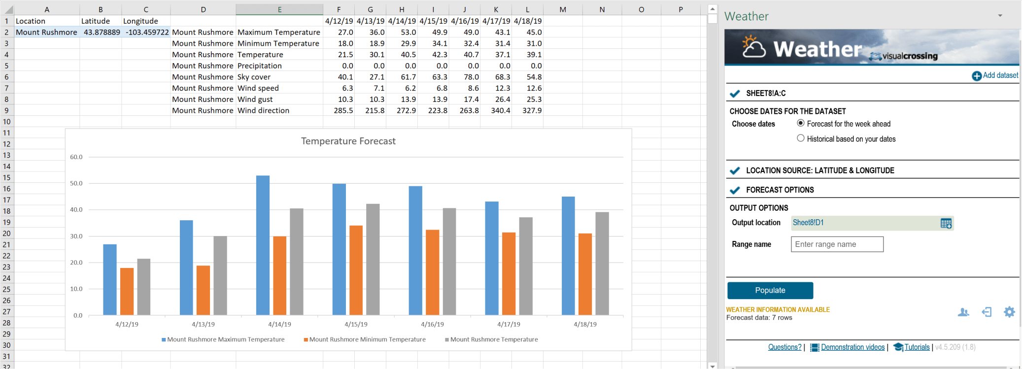
Although the forecast that I can get at the time of this writing is a bit too early to plan for summer, you can see how easy it is to obtain. What you see above took me less than 10 clicks. And based on what we learned above from the historical correlations, that temperature is a reasonable predictor of park attendance, it is easy to guess which days will be more crowed and which days the National Park Service may need to call in some extra workers.
In Summary
Not only did I learn the effect of various weather variables on Mount Rushmore attendance, I learned how easy it is to apply weather analysis to any type of data that I may encounter. Although the technology behind obtaining weather data is hard, modern tools such as Visual Crossing Weather makes using weather data as simple as a few clicks.
After obtaining the weather data itself, I also spent some time exploring several options available for correlation analysis in Excel. Although these options have some limitations, they provide a great starting point to understand weather patterns in any data we encounter. Armed with Excel and the Weather add-in, I can now find patterns in data that were previous hidden from view.